Rebranding Project
Tazo Tea
Problem Statement
Tazo Tea is currently amongst one of the top leading tea producing companies in the world. With many flavours, comes many designs. The main project objective here is to redesign the box without distorting the logo and current identity.

Current Logo Design
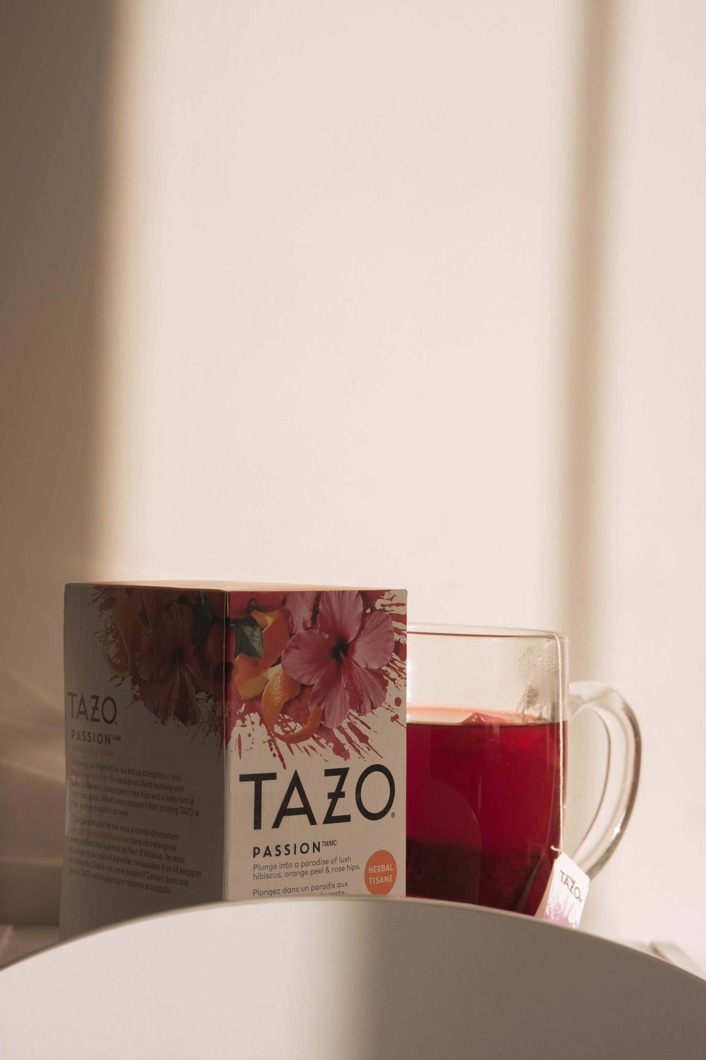
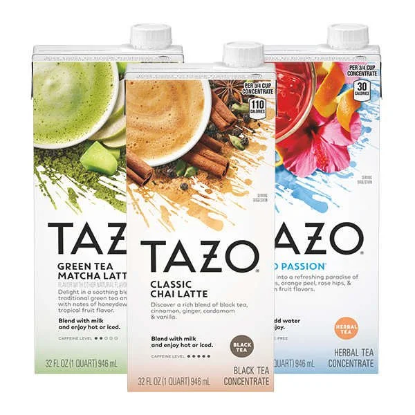
Tazo Tea Current Packaging
Project Branding Audit
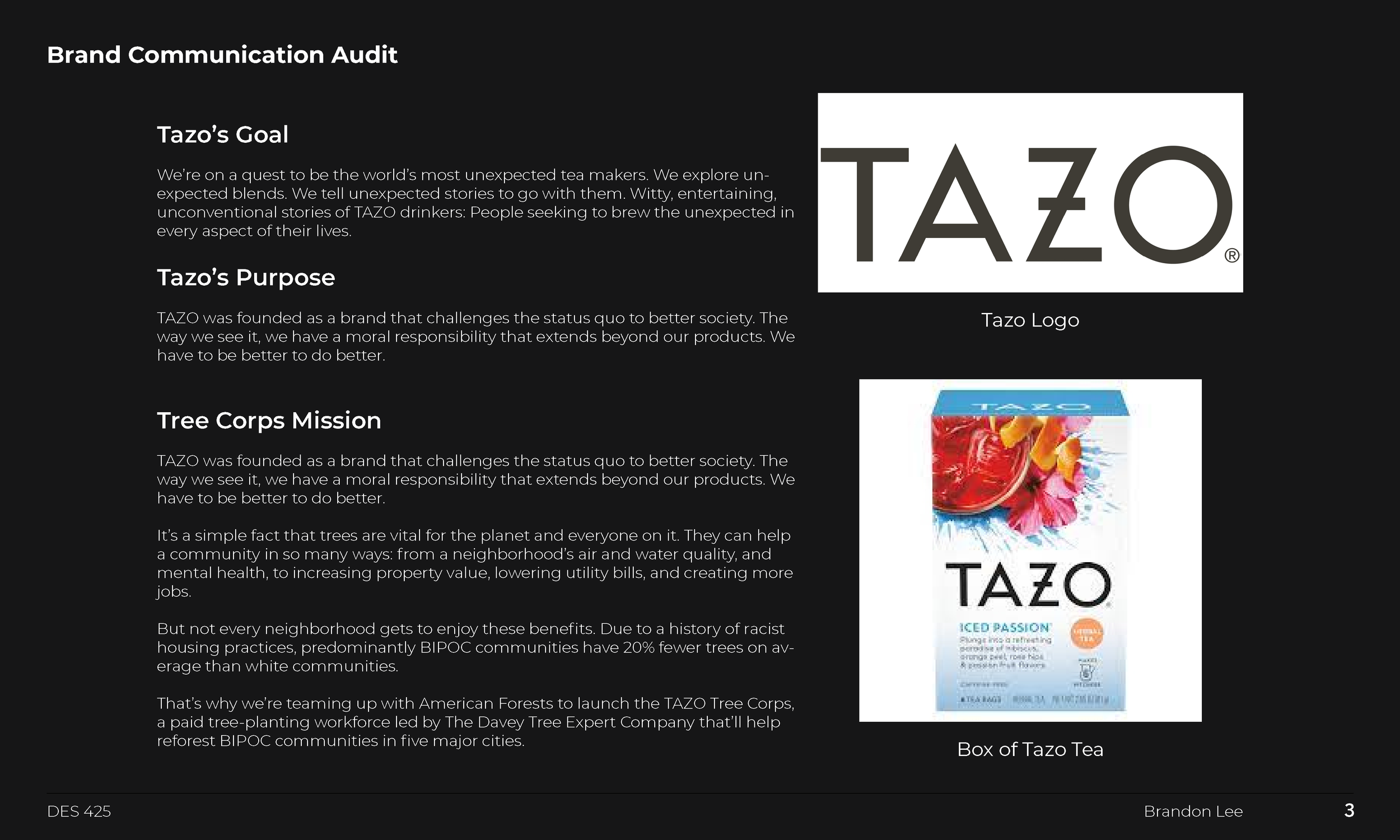
A collection of details to reinforce company values and keeping ideas fresh while analyzing the competitive market.

Branding Audit 1
Branding Audit 2

Competitor Analysis 1

Competitor Analysis 2
Iteration Phase
For this project, there are four rounds of different iterations. Each iteration utilizes different elements of design.
Round 1
My first iterations for 2 different paths of the rebrand for TAZO tea. The first box (left) was a simple utilization of hiearchy, size, and photography. The right box uses gradient to fade into another color of the box while using a more handwritten & friendlier typeface for all audiences.


Round 1A
Round 2
Direction 1 – Size, Hierarchy, and Subtitle. Aiming for High Contrast between background/text. Gradient has changed to Black. Logo remains in the center (75% opacity). Sans-serif, modern typeface: Coco Gothic.
Round 1B


Round 2 - 1A

Round 2 - 1B
Round 2
Direction 2 – Alignment, Hierarchy, and Size. High Contrasting Colors. Gradient has changed to Black. Logo is now at the corner, more homemade, handwritten TypeFace: StoryTime.
Round 2 - 1C


Round 2 - 2A

Round 2 - 2B
Round 3
Direction 3 – Refinement of Direction 2. Gradient/Background now stretches between all boxes. Connects faces together better. Overall. I found that it was hard to work with the “flavor” since it was interfering with the background.
Round 2 - 2C


Pumpkin Spice Chai - Extended Gradient Design

Final Design
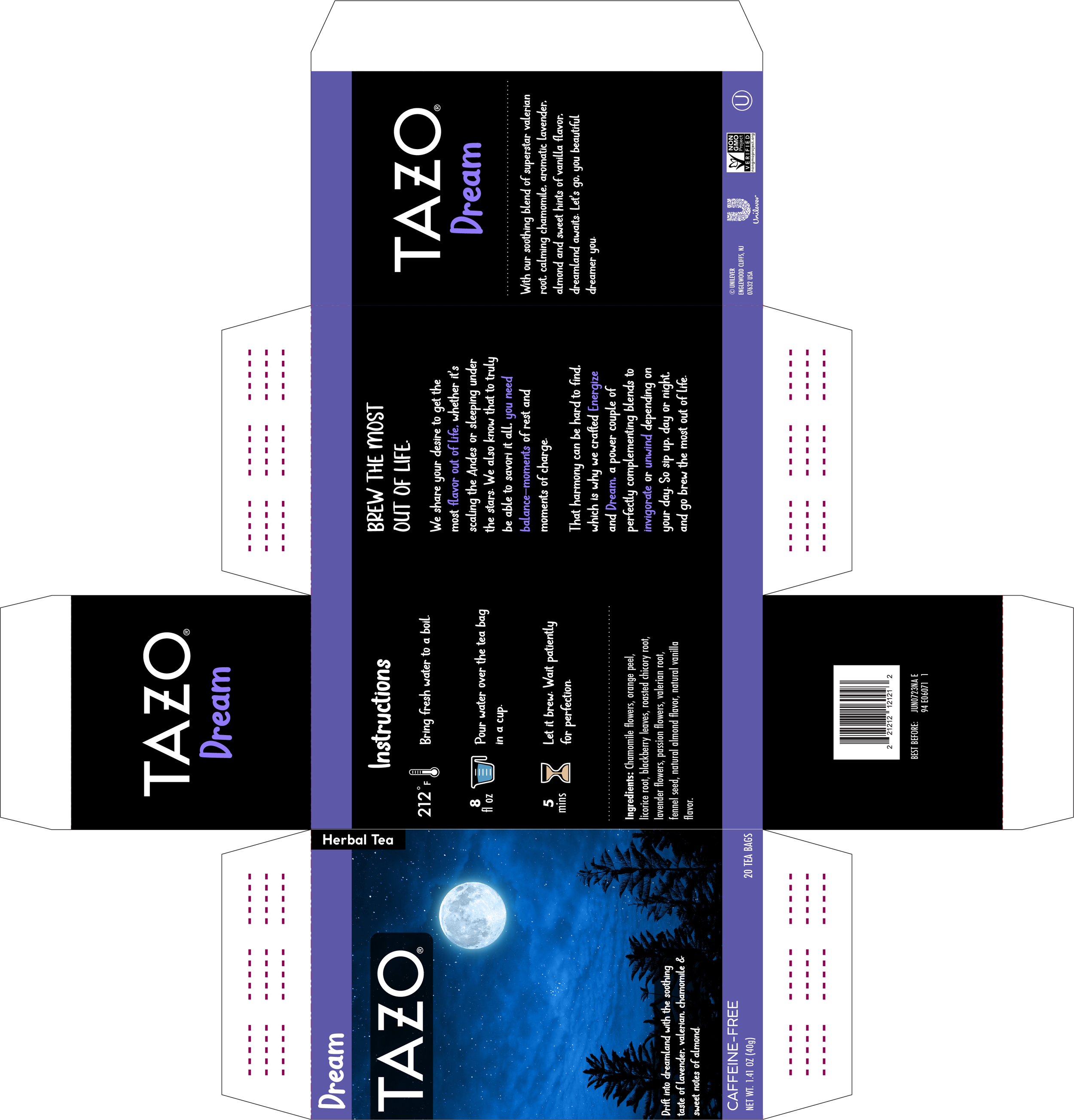
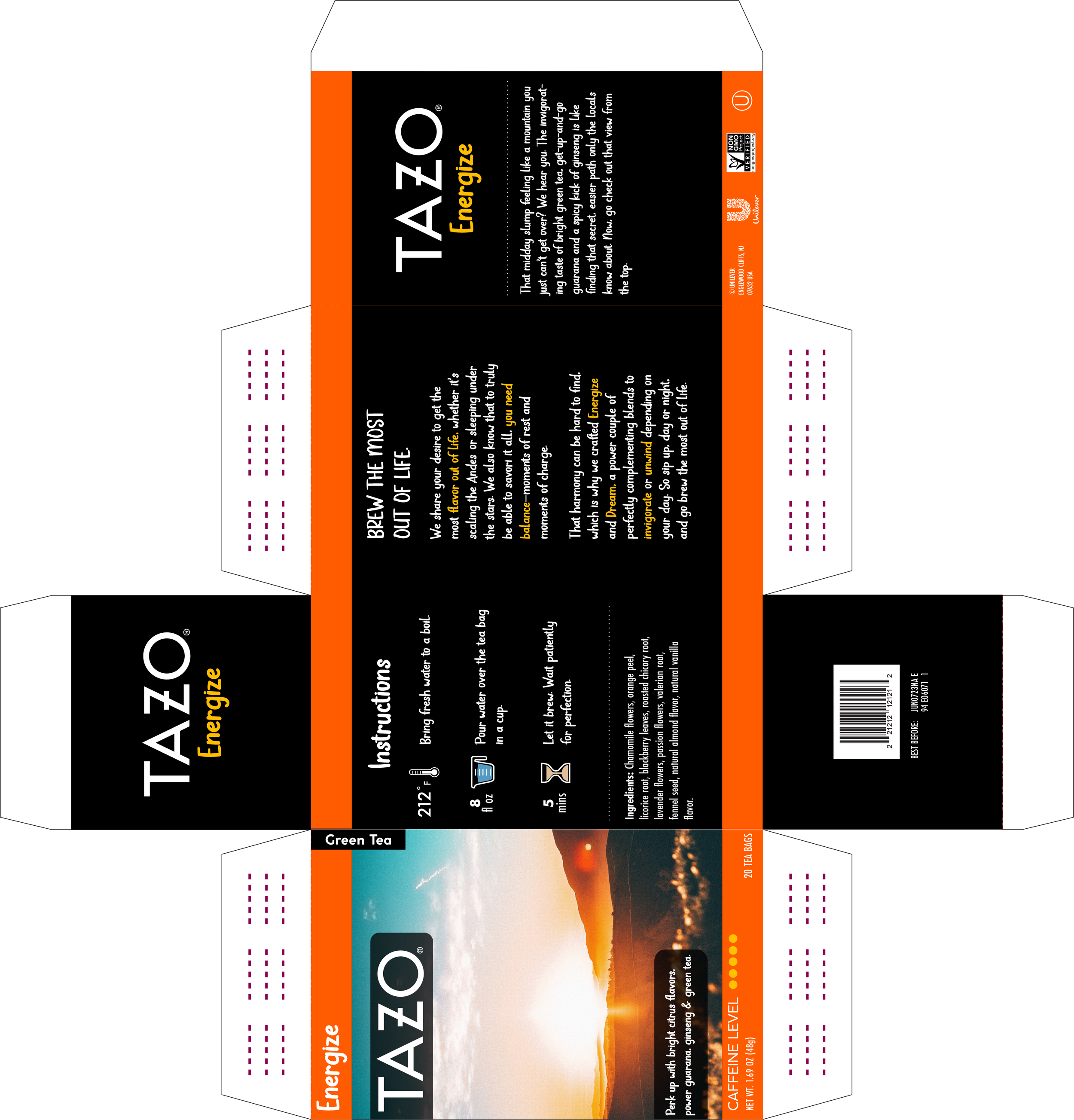
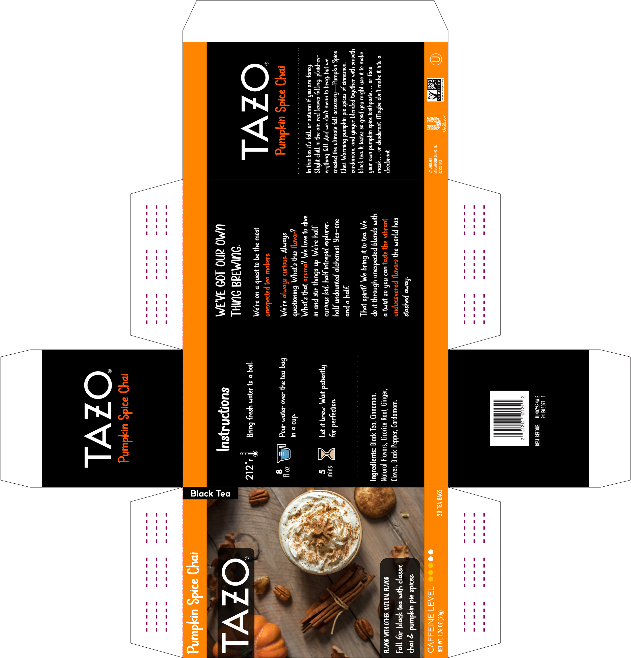
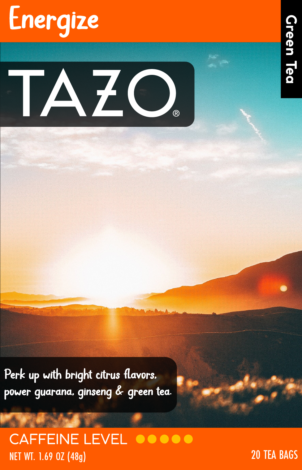
Final Iteration – Design now features different colors top/bottom to create a distinction of information/ flavor. More variety of color & overall easier to read for the user. This iteration is a combination of all previous design directions. Also adding separate 75% opacity boxes for the logo & description.

Final Design - Energize

Final Design - Dream

Final Design - Pumpkin Spice Chai

Final Design - Instructions Side Example
Final Design - Description Side Example
Client
Tazo Tea


